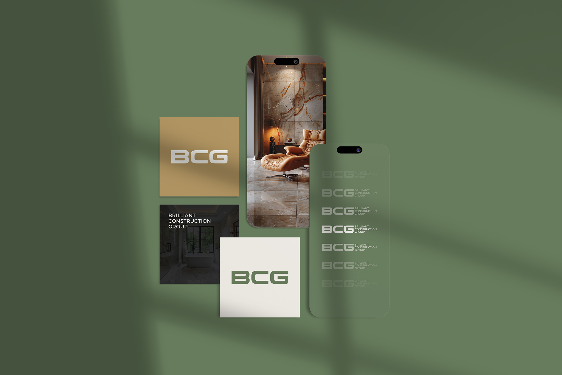
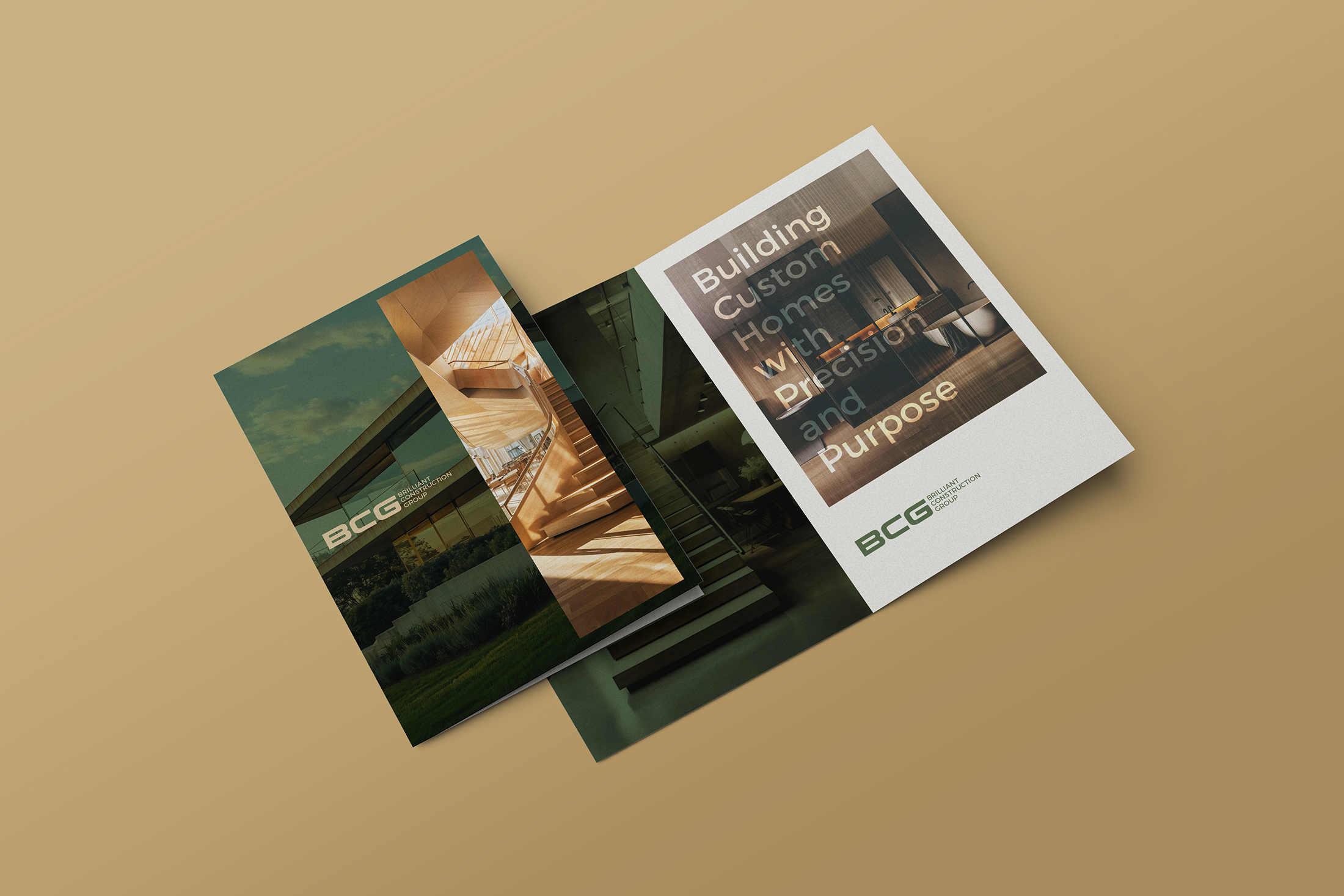
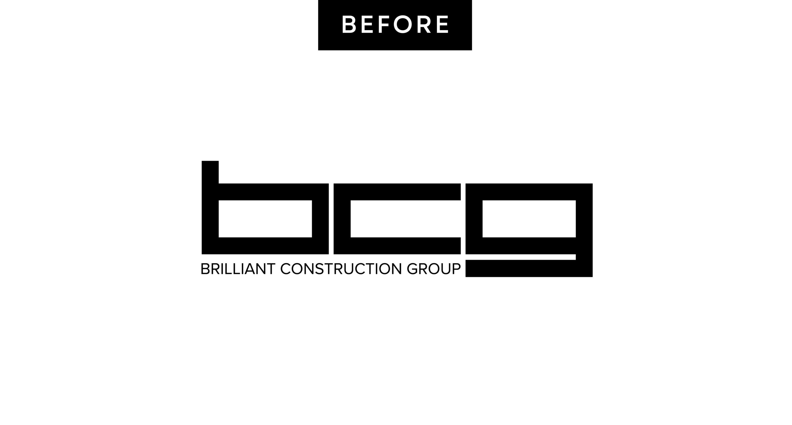
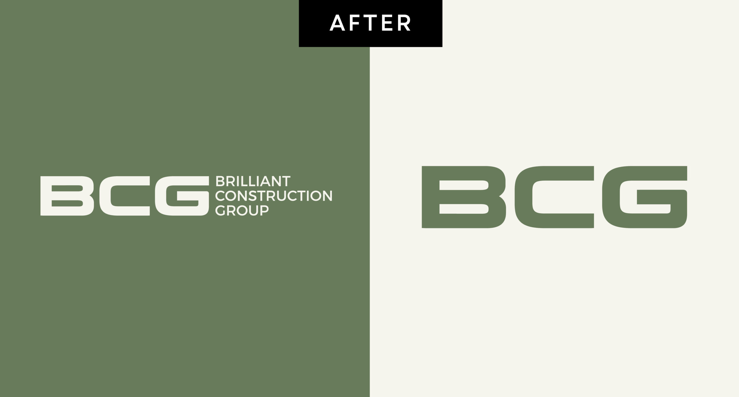
We began by refining the brand, designing a more versatile, readable logo and shifting the color palette from black and white to a warmer, more grounded combination of green, brown, beige, and black. The updated identity better reflects their balance of accessibility and quality. We also developed new marketing tools to match the refreshed look and tone. A redesigned website is now underway to bring the updated brand to life online and support their next stage of growth.